

Process: Editorial Illustration
How I approached a commission for an online publication

As someone who positions themself as a picture book illustrator, editorial was far from my mind. Previous experience included illustrations I did for a business magazine close to 20 years ago, and an assignment on the Narrative module within the Falmouth MA Illustration course. The latter opened my mind a lot more when it came to adding a visual dimension to an article, so I was a lot more prepared this time around.
The client approached me via email outlining exactly what the requirement was and what the parameters were — a far cry from the many vaguely-worded spam mails that address me as “3mongrels” instead of my name, regurgitate my IG bio at me and offer to grow my follower count by thousands — THOUSANDS I tell you!
Anyway.
They were very professional and to-the-point. A brief Google search of the client revealed that this was a genuine request, so I decided to move forward with the project.
Concept sketches


My absolute favourite pastime is overthinking things to the point of mental paralysis, where I do absolutely nothing for fear of screwing things up. Fortunately, the client had been quite clear about what they liked from my previous work and the elements that I should try to bring in here.
I started out with a couple of literal concepts — one where we see the author as a child beadily eyeing the mug of milk by her bed with a frown (because she despised drinking it), and another from the mother’s perspective.
The written piece was about coming full circle and realising that things you would argue about with your parents would usually come back to haunt you when you became a parent yourself, and that’s the moment you realise it was all done out of love. That’s what I wanted to convey by focusing on the mother, showing her quiet relief at the child finally consuming some nutrients to get her through the day. Even as someone who is only a pet parent, I could relate to that “phew, thank goodness she’s eating something” feeling.
The final option I submitted was more abstract: numerous ‘Amma hands’ pushing plates full of breakfast foods at the child shrinking away at the edge of the table. There was some humour in it, but it felt a little removed from my usual work. Thankfully, they went with the mother’s perspective option.
Adding Colour
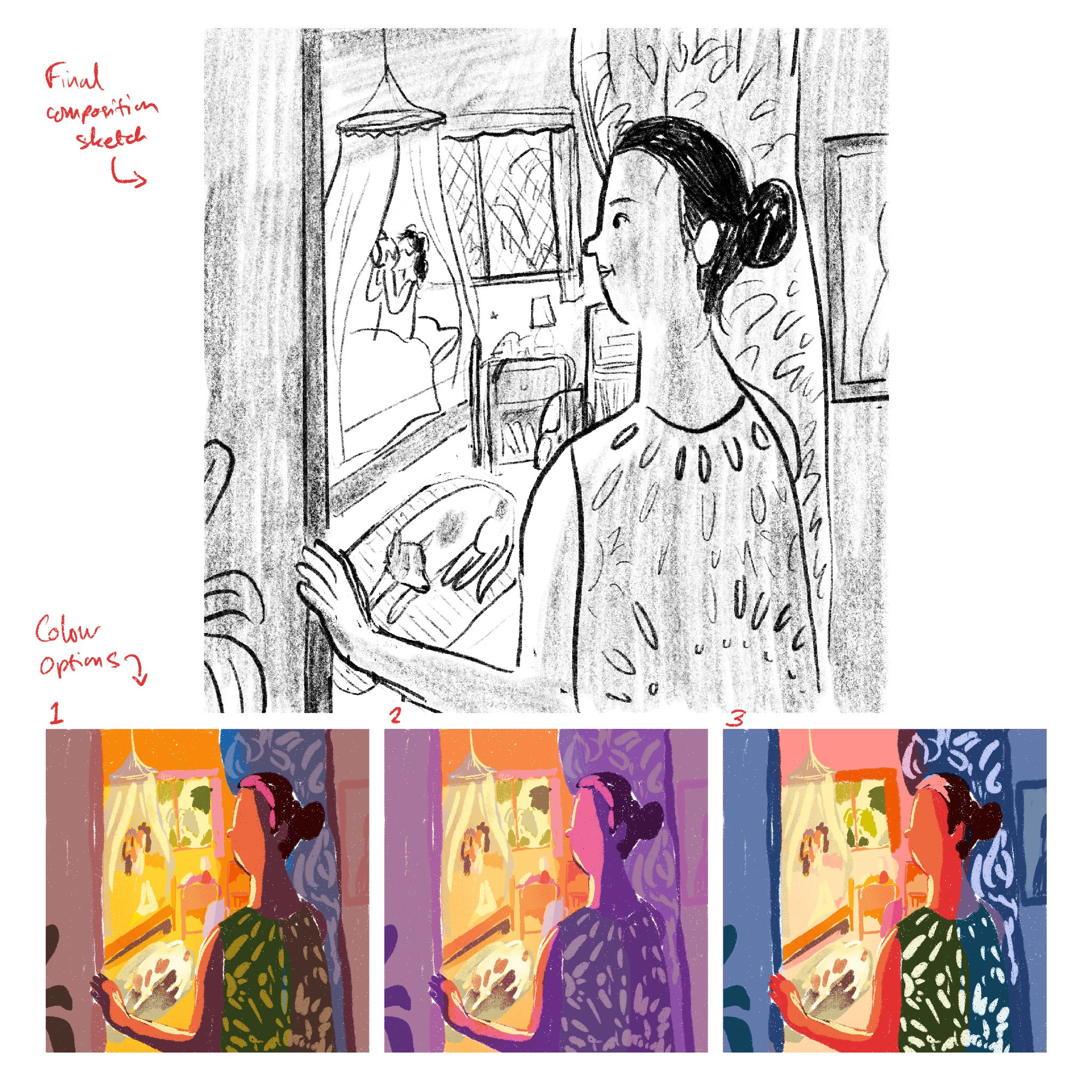
Colour was a bit more tricky. I started out with my own limited knowledge of colour theory mixed with the direction of ‘warmth’ from the client as well as my understanding of the child’s bedroom, mother’s dress, doorway curtain, etc. Then I did a couple of variations on it — one more nostalgic toned like a discoloured Polaroid reflecting memories of childhood, and one with exaggerated colour.
We settled on the first option with a couple of final tweaks such as darkening the hallway more to increase the contrast with the room. The client was an AD with a wonderful way of articulating exactly what he wanted, and I learned a lot from the feedback myself.
The Final Work
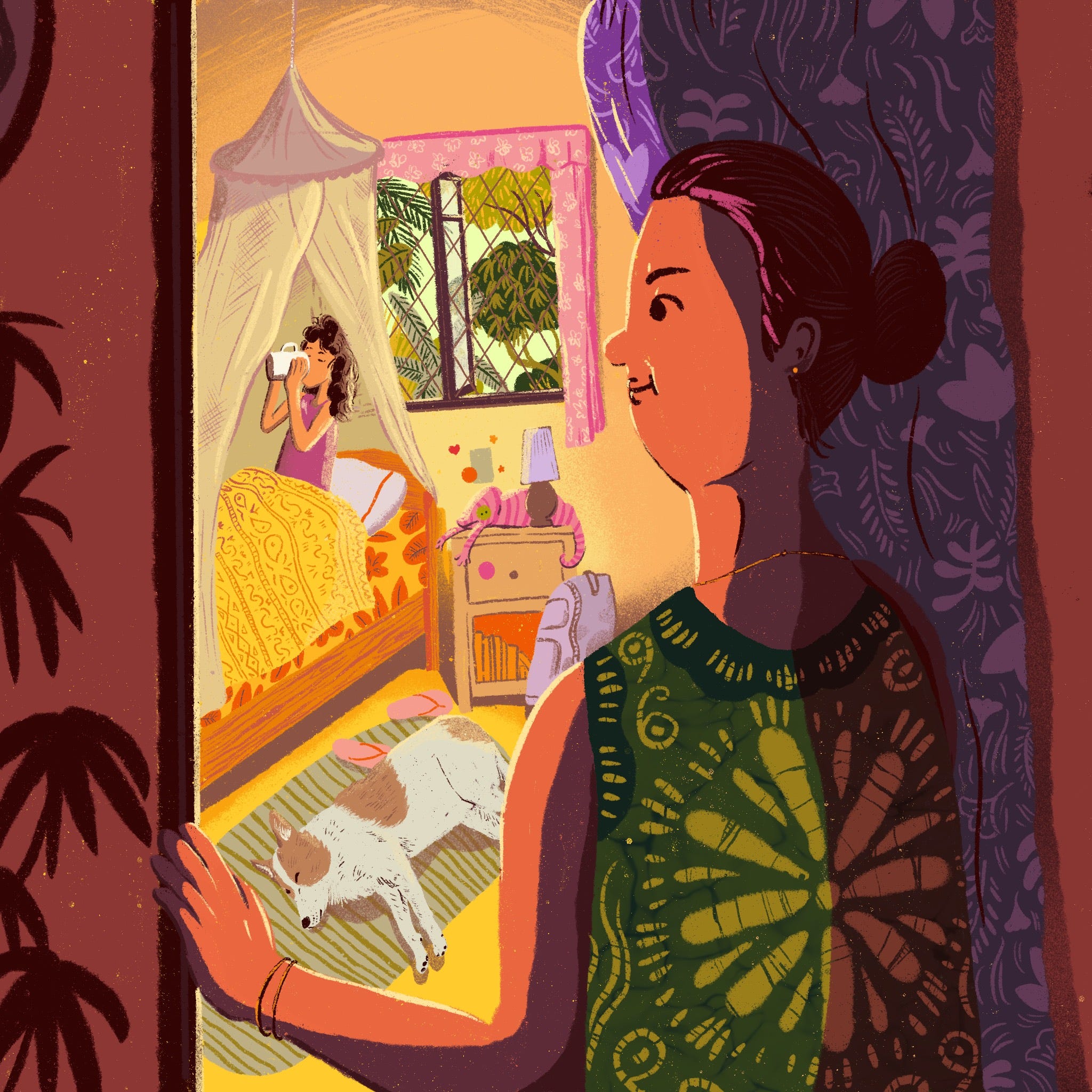
After a few days and one more round of finishing touches, I finally delivered the final. This isn’t my story, but my mother also made me drink a cup of milk in the morning because I refused to eat breakfast. She would bring it to me, as if I were royalty, and I would drink it in bed like this. In fact, this bedroom was based on my own back in the day. The dog’s patches are based on my dog. The mother’s batik dress mirrors a floaty orangey-red number my own mum used to wear. Draw what you know, right?
☕☕☕
I hope this process was useful in some way, especially if you’re an illustrator just starting out. I wanted to document this process and share it because I was really pleased with the outcome.
You can read the article ‘Kiri’ here.
It’s great to read about your process. The idea was really strong from the beginning and works so well with the article. Congratulations!